
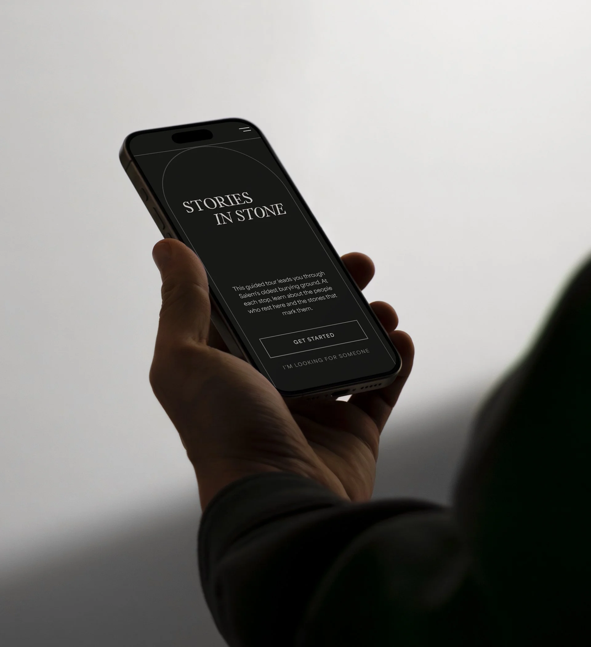
HISTORIC SITE DIGITAL EXPERIENCE
A conceptual redesign of the Charter Street Cemetery website, with new self-guided tour.
This project reimagines how visitors discover and experience one of Salem's oldest and most significant burial grounds. The redesign spans two interfaces built for different moments in the visitor journey: a website for research and pre-visit planning, and a self-guided tour for in-person exploration. Together, they work as a single system, guiding visitors from curiosity to a deeper connection with the site's history.
Role UX/UI Designer
Project Type Website Redesign
Context Conceptual
PROJECT CHALLENGES
-
The Charter Street Cemetery experience, both online and in person, has room to grow. The cemetery holds real historical depth, but little of that story comes through in how visitors currently discover or experience the space. There's no clear starting point to help visitors understand what the cemetery is, its significance, or what to expect before a visit. The result is a rich historic site that visitors approach with little context and few ways to connect with it.
-
The current website offers minimal information, and what's there isn't organized in a way that's easy to digest. The next step for visitors isn't always clear, and the site doesn't fully capture what makes the cemetery worth visiting or invite further exploration. Someone researching a visit walks away with a name and a location, but a limited understanding of what makes the site worth seeing.
-
In person, the only resources are a paper map listing notable burials, a large stone map that's difficult to read, and a visitor center which covers the site's location and general funeral customs, but doesn’t touch on the actual people. Guides are present but limited, and while some tours pass by, the cemetery is often a quick stop rather than a place to explore. Much of the cemetery's history goes unnoticed by the people walking right past it.
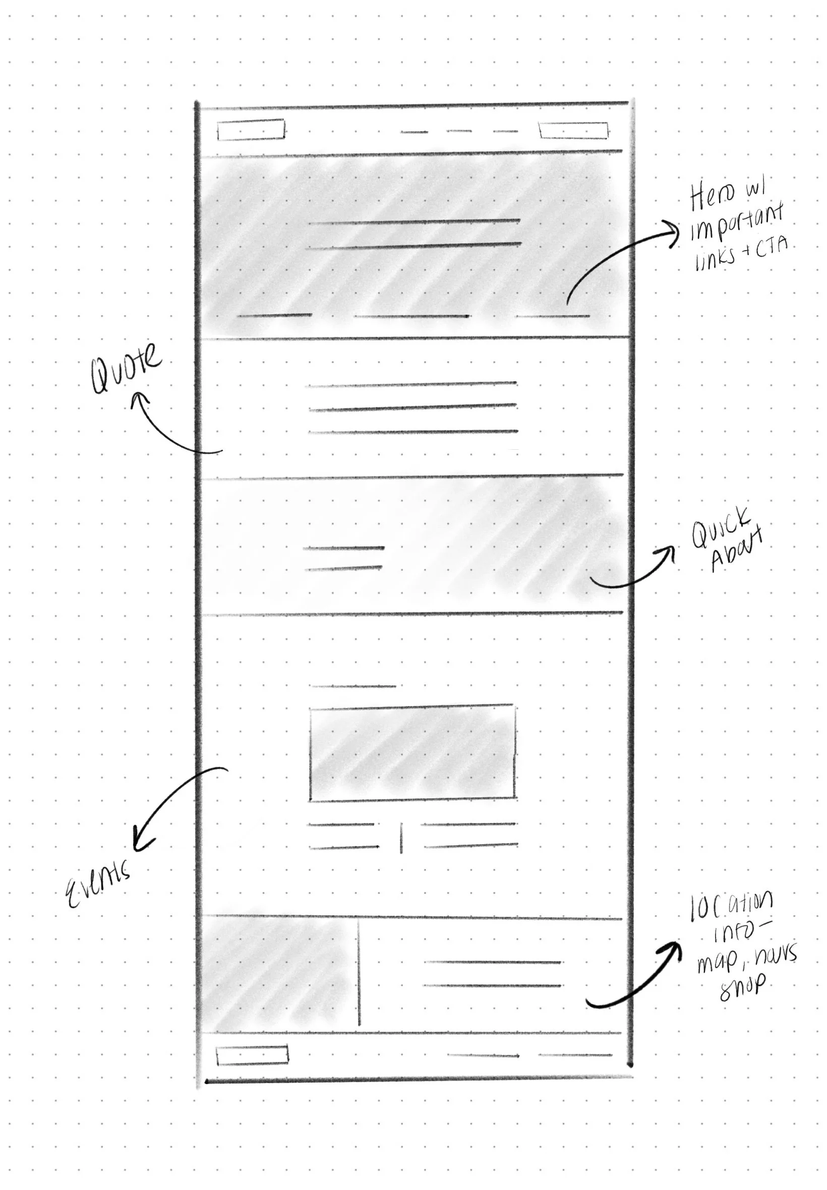
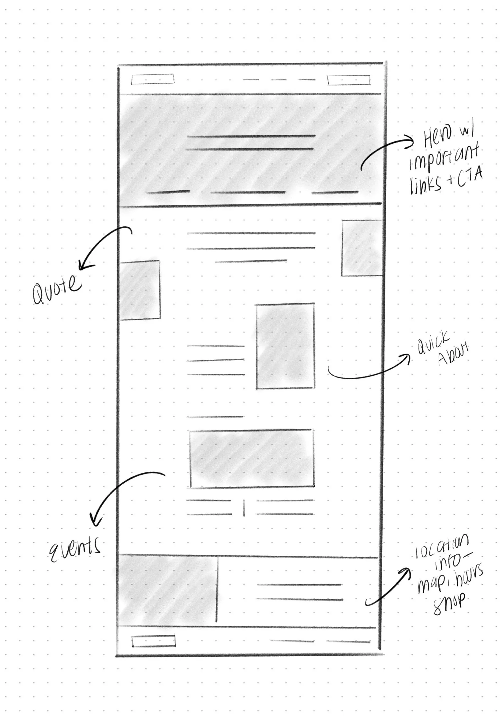
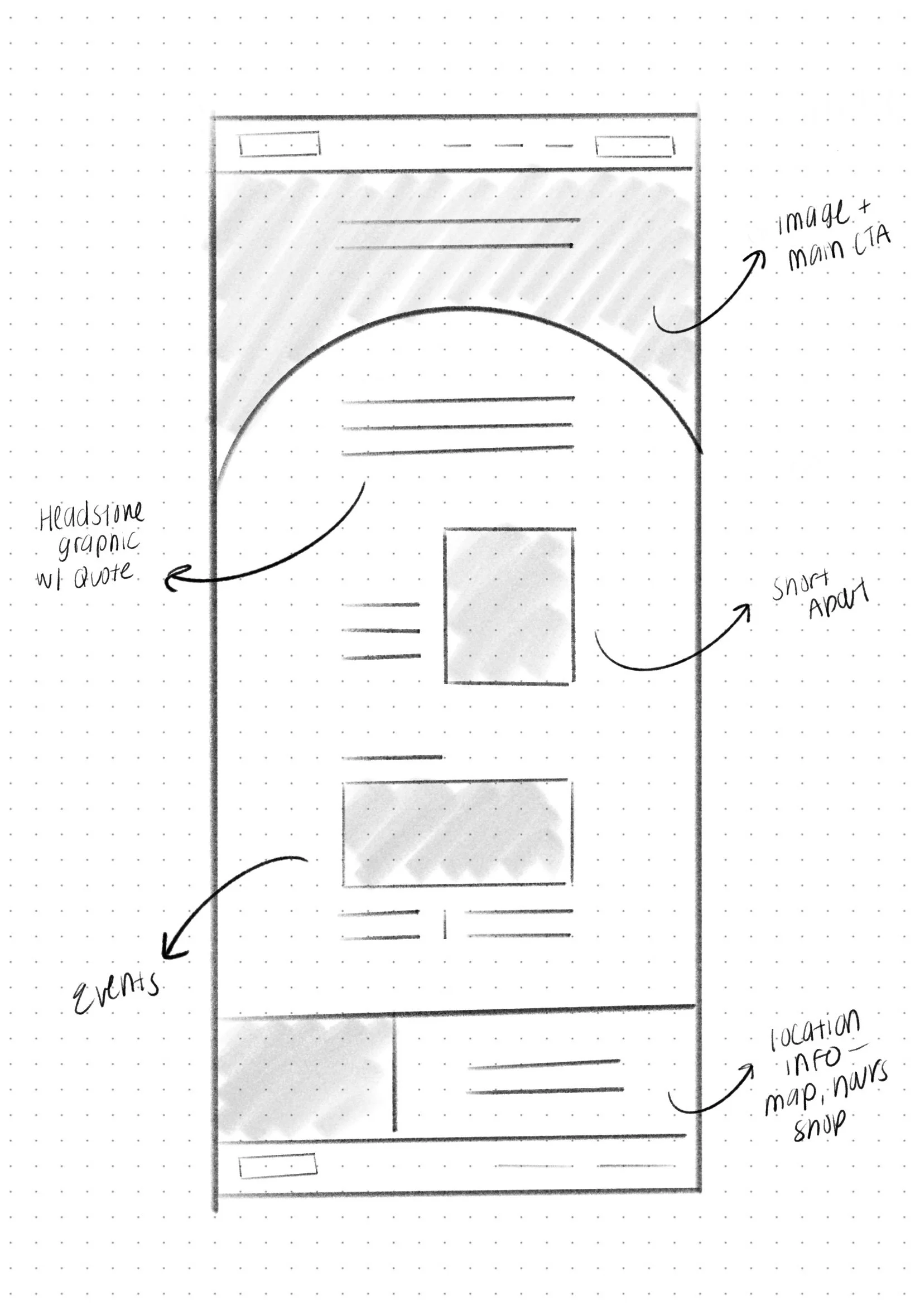
Before landing on a final direction, early sketches helped work through layout, hierarchy, and how visitors would move through both the website and the tour. A few of those early explorations are shown here.
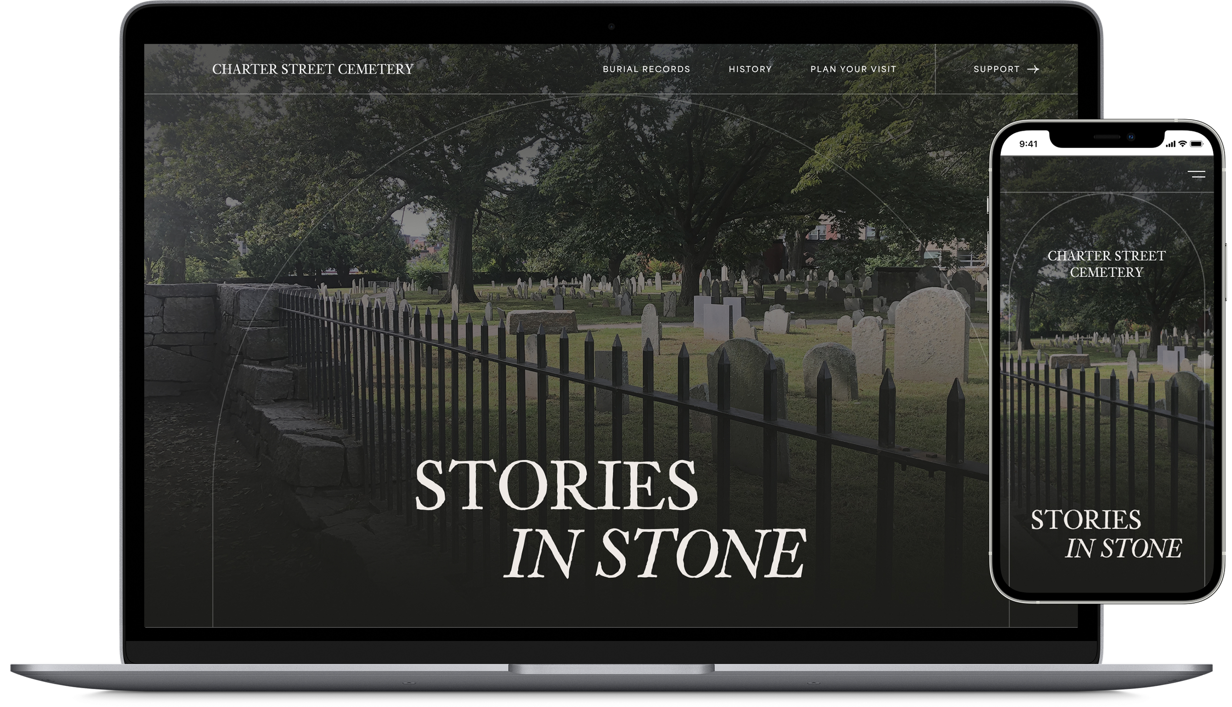
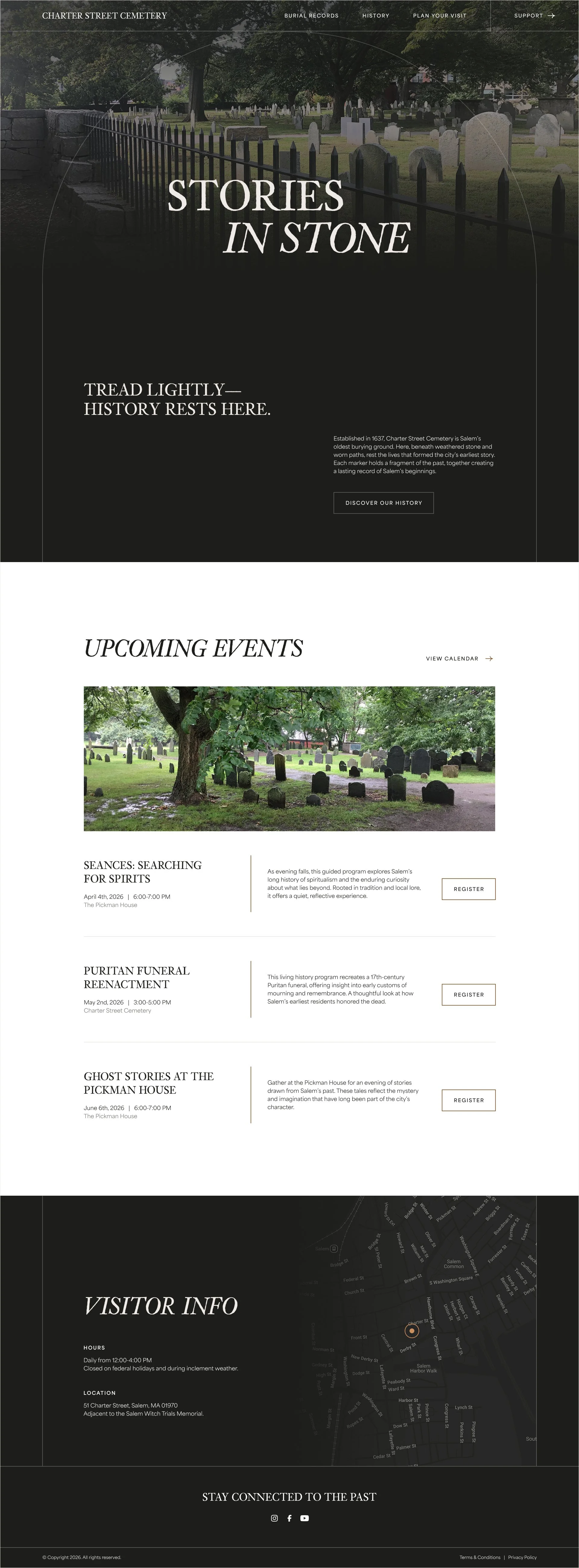
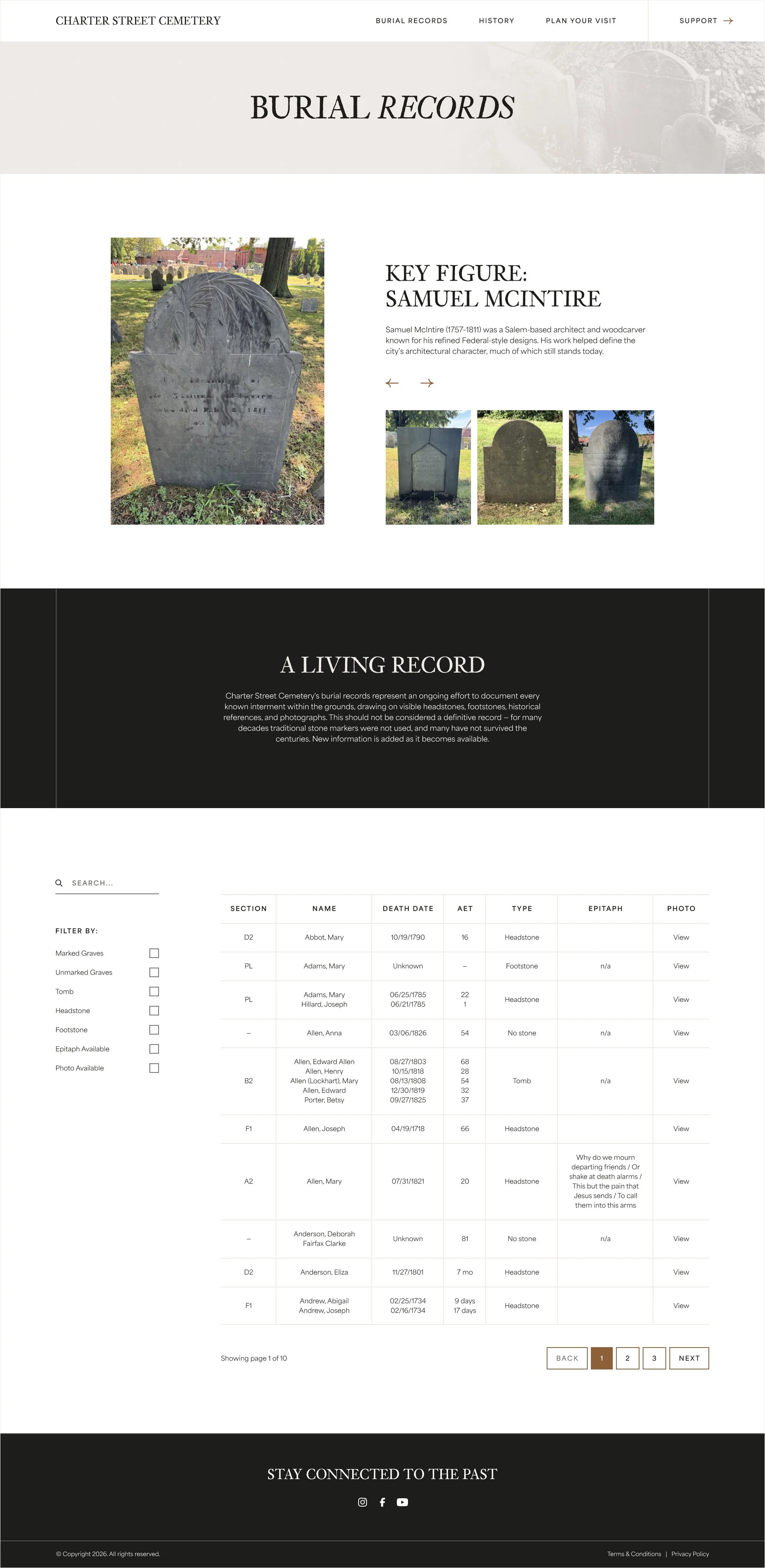
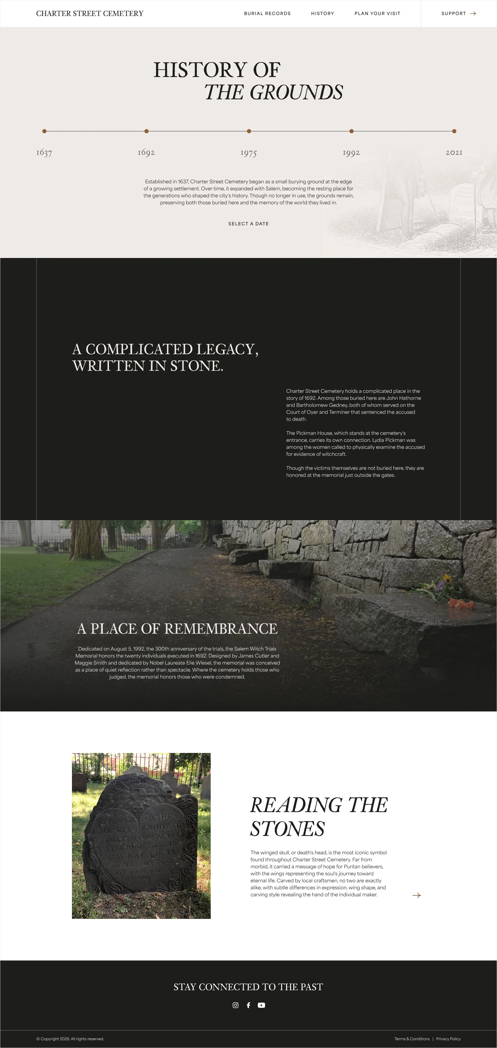
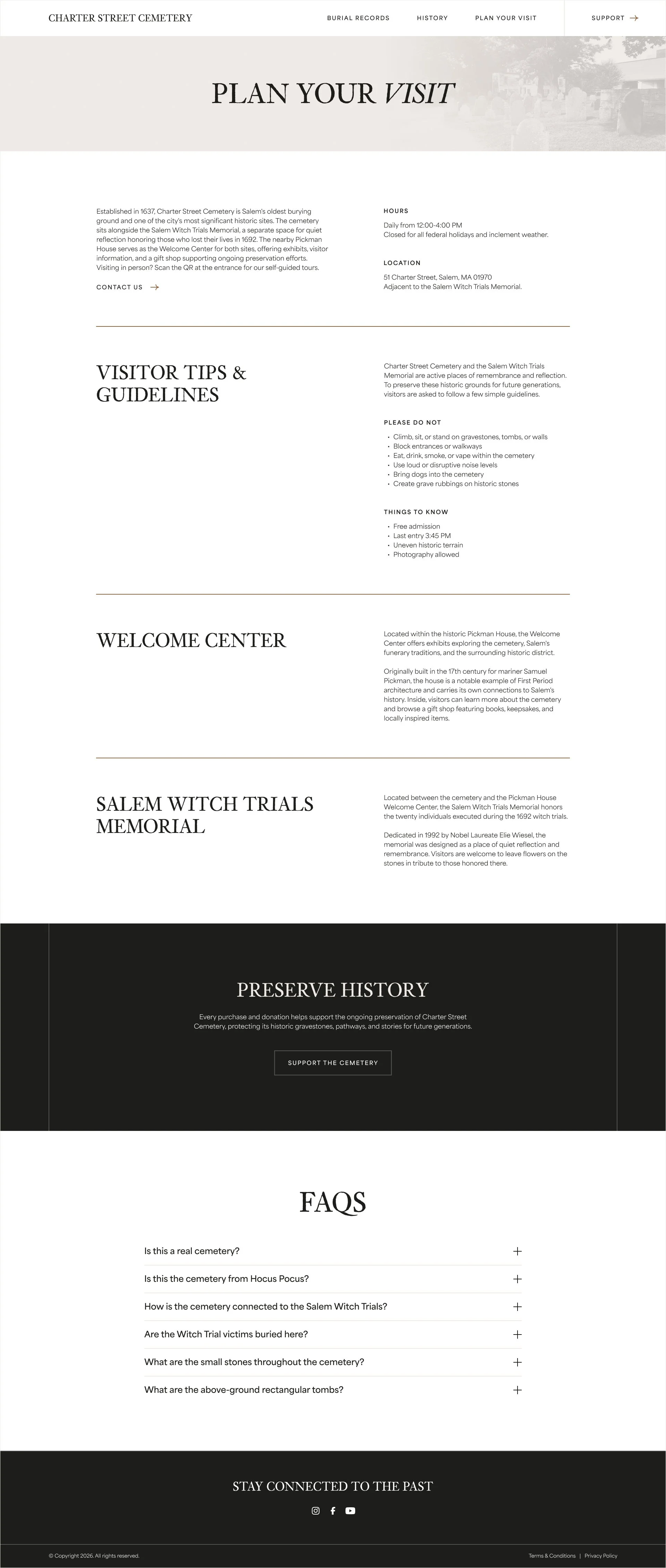
The website redesign centers on three main pages, each built around a distinct purpose. Visitors first land on a homepage designed to pull them in, teasing the cemetery's history while spotlighting upcoming events to encourage visiting. From there, Burial Records makes key figures easier to discover, pairing photography with a more intuitive way to interact with the archive. History does similar work, using an interactive module to move through key moments in time. Rounding it out, Plan Your Visit lays out everything a visitor needs to know in clear, easy to scan sections. The website now goes beyond making information easy to navigate, but gives the cemetery's story a place to be told and every visit a clear place to begin.
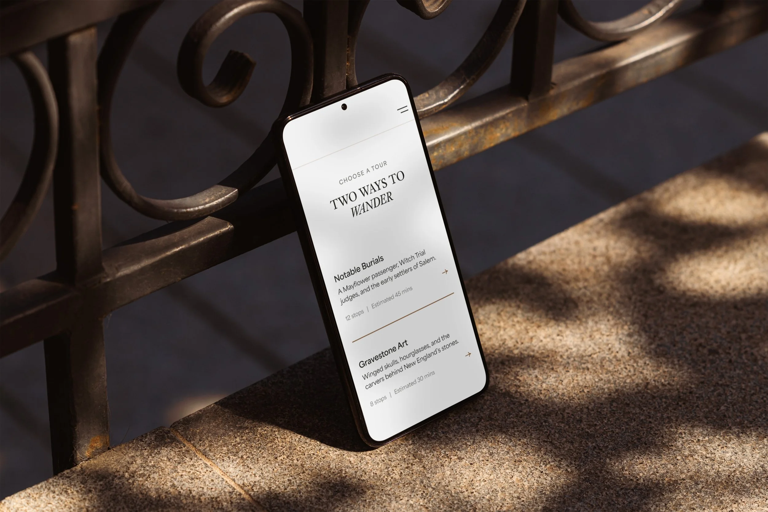
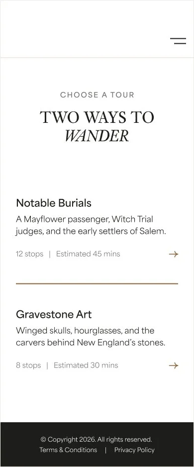
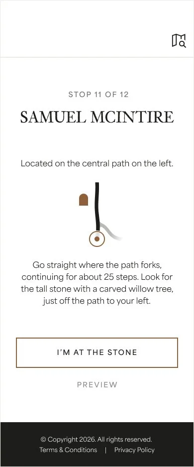
The self-guided tour extends the experience beyond the website, letting visitors explore the cemetery in person at their own pace. Signage at the front gates invites people to scan a QR code, no app or download required, to begin right where they're standing. From there, visitors choose how they want to explore, through the people buried on the grounds or the art carved into the gravestones themselves. A separate hand-held map lets visitors search for specific names and locate them anywhere in the cemetery. Together, the tour turns a quiet walk through the grounds into a guided, personal way to connect with the site's history.


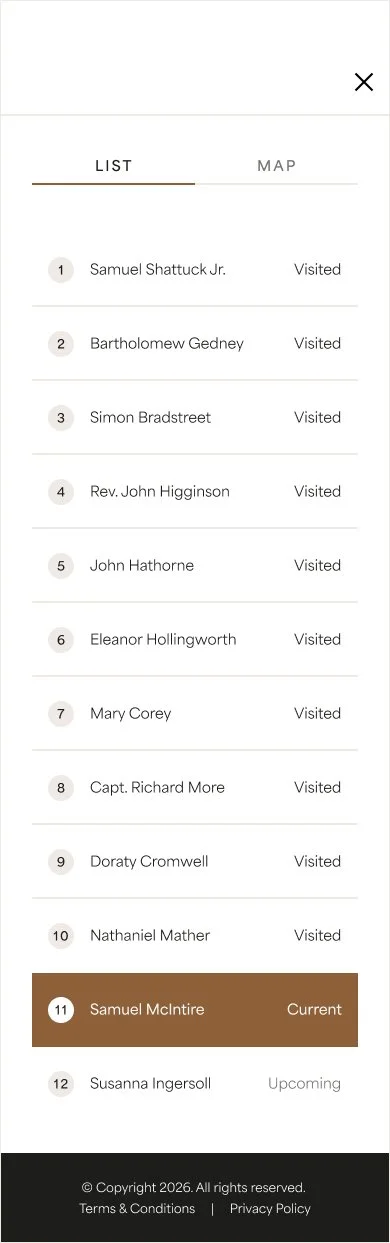
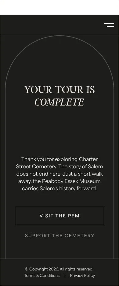
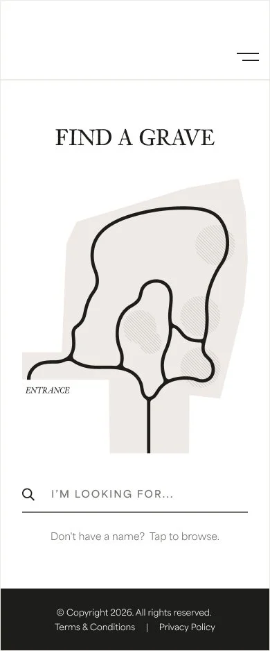
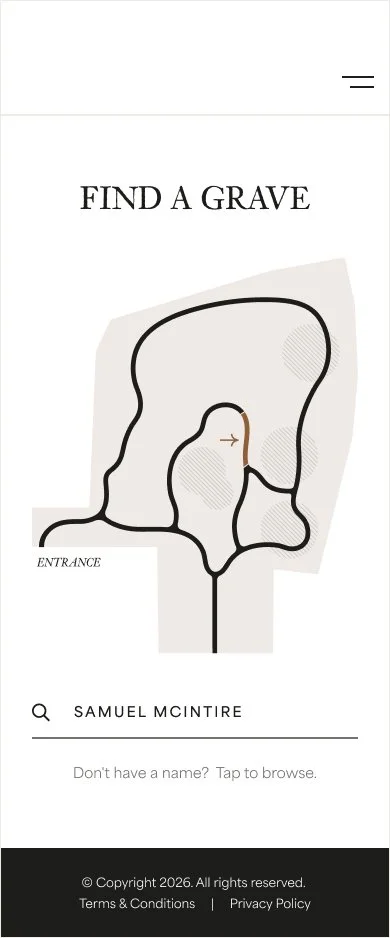
Together, the website and self-guided tour form a connected system, one that invites visitors in, then meets them on-site with the tools to explore further. Projects like this show what's possible when historic public spaces are given the same design attention as any modern product: a chance to be more accessible, more engaging, and easier to connect with for anyone who visits.